PROJECT CASE STUDY
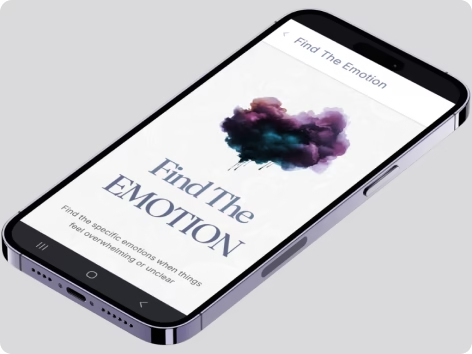
Find the Emotion
An interactive tool that helps users explore and understand their emotions through a guided journey.
Target Audience: Designed for individuals in therapy, coaches, and people seeking personal emotional clarity.
TIMELINE
2 Weeks
Conception to launch
Role
End-to-End
Design, Research & Code
Core Stack
ReactJS
TypeScript & TailwindCSS
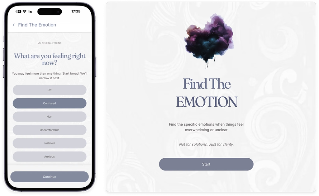
01 / THE Problem
When you can’t name the feeling, you can’t trace it back to the story behind it.
Sometimes we experience multiple emotions all at once. When we try to name what we’re feeling and decide which emotion feels the strongest, we may pick one that surfaced later. That emotion can mask the original pain point and the story behind it.
At times, we might feel off, like something is on our mind, but we can’t really tell what it is. The only thing we know is that we’re not at peace. We might notice an unpleasant sensation or some irritation, but we can’t tell what it is, why it’s there, or where it came from.
In our quest to understand our triggers and the stories behind them, it’s essential to gain clarity and distinguish the original emotion which started it all from the others that might have come later and ones that are falsely identified as how we truly feel.
A moment at work
I was sitting at my desk when a heavy feeling came over me. Earlier, my manager had emailed me to point out a mistake I’d made. I remember reading his words as cold, though I couldn’t tell what tone he intended. Was I angry at myself for making a mistake? Did I feel hurt or undervalued? Was I frustrated with myself for making yet another mistake? Did I really make that many, or was I just being hard on myself?
I wanted to know what I was actually feeling and what had brought it on. What fear had the email stirred up? What was I telling myself that mistake meant about me? I was sure that if I could see the story I was telling myself, I could change it.
02 / THE INSIGHT
The mind sees the possibilities. The body knows which one fits.
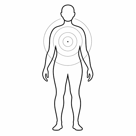
I wanted to build an app that would help people recognize what they were feeling by paying attention to their bodies. I’d learned long ago to notice how my body responds to the words I use. When I say something that feels true to me, I notice a sensation. When I say something that feels off, my body responds differently. I can feel the difference.
As we go through a list of emotions, we can pay attention to those sensations and notice which words fit what we’re feeling. To find the strongest emotion, we first need to give space to all the emotions we feel in that moment. Then we can sort through them and notice which ones stand out.
If we’re asked to name the strongest emotion right away, we may end up guessing, relying on our thoughts alone and overlooking the signals our body is giving us.
03 / KEY DESIGN DECISIONS
From abstract feeling to crisp somatic clarity.
Three deliberate architectural pillars crafted to reduce shame,
eradicate fatigue, and promote intuitive personal reflection.
DECISION 01
Design for phones first
I built Find The Emotion as a web app designed primarily for phones. Feeling confused about what you’re feeling can happen anywhere, and your phone is often what you have with you in that moment.
DECISION 02
Give each screen one job
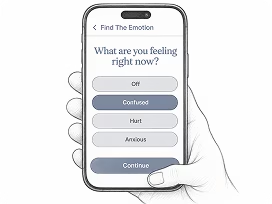
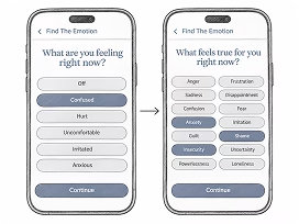
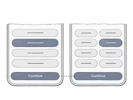
When someone is already feeling overwhelmed, I wanted each screen to ask for one thing at a time. The flow starts with a broad sense of how you feel, then presents the full list of emotions and helps you narrow it down until the strongest one stands out. I wanted it to feel like taking an online quiz where the answers come from the person taking it.
DECISION 03
Keep the controls simple and consistent
I initially explored animated buttons and even considered rotating 3D cubes. I chose simple buttons and familiar controls so people could focus on what they were feeling. A large Continue button at the bottom of each step made it clear how to move forward.
INTERFACE DETAIL
A palette for slowing down
I started by testing reddish shades, then moved toward calmer blues before settling on muted blue-gray (#848C9F), light gray (#D3D5DB), and off-white (#F6F5F6). I tried pairing the blue with a second color, but each combination changed the quiet feeling I wanted to keep. To me, red felt urgent, while orange and yellow felt more expressive. The muted palette gave the interface a soft contrast and a sense of calm. I wanted it to feel approachable even when someone was already overwhelmed and needed a moment to sit with what they were feeling.
04 / TECHNICAL ARCHITECTURE
A mobile app feel in the browser
Although Find The Emotion is a web app, I used horizontal screen transitions, subtle interface animations, and consistent navigation to make moving through the experience feel fluid and closer to using a native mobile app.
How I built it
Find The Emotion was my first project using Cursor for AI-assisted coding. I defined the flow and architecture, while Cursor helped me implement them. The difficult part was learning to trust AI-generated code while still protecting the structure I had in mind. I also questioned whether identifying one dominant emotion was substantial enough to justify an app and considered adding accounts, profiles, and a database. Building Get Out Of It, a separate tool that helps people work through difficult emotions, showed me that naming the emotion is an essential step on its own. Since Find The Emotion only needed to guide users through their current session, I kept it focused and entirely client-side, without a backend, database, or user profiles.
The architecture follows the same narrowing process as the experience. Each step is a screen with one responsibility, and the choices made there become part of the shared state used by the screens that follow. I built a lightweight navigation system around the browser History API instead of using React Router. React Context and a reducer manage the accumulated selections, while sessionStorage preserves the current screen and progress if the page is refreshed. The main engineering challenge was keeping the screen location, browser history, and session data synchronized throughout the flow.
I chose React, TypeScript, and Vite because the app did not require server-side features or a larger framework. Tailwind CSS made it faster to design and refine the interface without introducing separate style modules for every component. I used Motion, a React animation library, for horizontal screen transitions and smaller interface animations. These movements helped the browser-based experience feel fluid and closer to a native mobile app.
Rendering and animating each screen
export function PageStackOutlet() {
  const { currentPageId, stackKey, navigationDirection } = usePageStack()
  const Page = pageRegistry[currentPageId]

  return (
    <div className="relative min-h-0 flex-1 overflow-hidden">
      <AnimatePresence initial={false} custom={navigationDirection}>
        <motion.div
          key={stackKey}
          role="presentation"
          custom={navigationDirection}
          variants={slideVariants}
          initial="enter"
          animate="center"
          exit="exit"
          transition={slideTransition}
          className="absolute inset-0 flex min-h-0 flex-col bg-transparent"
        >
          <div className="min-h-0 flex-1 overflow-y-auto">
            <Page />
          </div>
        </motion.div>
      </AnimatePresence>
    </div>
  )
}